
ZortchTest
A downloadable game for Windows
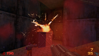
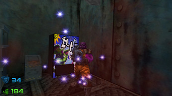
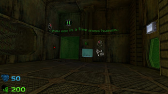
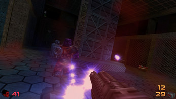
Zortch Maxinum's holiday didn't go as planned: aliens tricked her and want to eat her brain .. her day was absolutely ruined!
..and now yours will be too!
this is a public beta of the first level of Zortch: if you find bugs please be sure to tell me about it and also if you could share your specs ( windows version, video card etc) that would help me a lot
system requirements: Win XP 32bit or better
for Win8 you will need the itch.io app to install and play (if you are not admin)
07/02/2023 Update: thank you for everyone who downloaded the first zortchtest - I added the second one - same level but many rendering bugs fixed
07/04/2023 Update: uploaded the ZortchEaster demo
16/07/2023 Update: added OpenAlTest - a special version that uses a more recent version of OpenAl and comes with openal-info
06/09/2023 Update: added uncaptest - in this version the camera moves at 240 fps in uncapped mode (and there is a message on screen when it does)
08/04/2025 Update: added inertia test - a movement fix test for people who have trouble with the default inertia
10/04/2025 Update: inertia test part 2 - halved walking speed
Update: FULL GAME is now out! get it here: https://mutantleg.itch.io/zortch
| Status | Prototype |
| Platforms | Windows |
| Rating | Rated 4.8 out of 5 stars (13 total ratings) |
| Author | mutantleg |
| Genre | Action |
| Tags | 3D, Dinosaurs, Female Protagonist, First-Person, FPS, Horror, Low-poly, Sci-fi, secrets, Singleplayer |
Download
Development log
- Zortch DemoApr 07, 2023
- Zortchtest2Feb 07, 2023
Comments
Log in with itch.io to leave a comment.
I love how this turned from something I have been waiting for my entire life watching the devlogs and stuff to an incredibly good game 100% worth it lol
thank you for your kind words 👍
tbh I still see it as just a doom clone 🤔
(like the formula has been out there for 30 years and counting - a big studio - heck a middle studio
could throw a game together like this in a few weeks - only I take my sweet time .. 😔 oh well )
Im so glad I was reminded about zortch, its the definition of hidden gem
Full Demo NO Commentary
I'm sorry dude. I've been waiting for your game and I have money, but it seems in my country I can't buy it. I hope someday the world will be calmer.
no worries I already figured a solution .. do you happen to have a youtube channel? 🙂
(which country are you from btw? just out of curiosity)
I don’t have a channel, but I would start one on such a case :D
(I am from Belarus and things are not going very well here)
I was just going to suggest that 👍 - after you do contact me at mutantleg(at)gmail.com
Played the first level of the latest demo build and I thoroughly enjoyed it overall, great work to those involved however I do have issues playing it though personally; due to the low FOV and the speed of the game, feels like I'm persistently zoomed in and that makes me nauseous a horizontal FOV slider would be amazing, did also notice camera jitter here and there and a far less incredibly limited FPS cap and a unlimited option would be tremendous (slider with increments of 1 instead of arbitrary limits would be most ideal as it's a great.) Thanks for sharing what's on offer right now in this early demo, looking forward to seeing more - here's my PC specs: Win11 Pro, RTX 3080 Ti, i7-11700KF @ 4.5 GHz, 32GBs of DDR4 RAM @ 3600MHz, NVMe SSD with all drivers up to date, target resolution and framerate is 1440p on a adaptive sync 240hz monitor at a locked 60 FPS whilst playing as it's the highest it can run presently GPU and CPU utilisation was in the single digits so it seems efficient but would love to use some of that headroom for some smoother and better input responsive gameplay.
I'm glad you enjoyed it!
I'm afraid there is no point in going over 60fps because the game logic is locked to that
you can get better horizontal FOV by playing in windowed mode and stretching the window manually
That is... incredibly disappointing to hear; a tweakable FOV seriously can't be done without forced to play windowed and stretching said window? that isn't gonna work great for a couch setup and playing windowed mode isn't something I particularly enjoy along with it being a fast paced FPS with a framerate logic locked. Those are fairly big deal breakers for me as they seriously help with my motion sickness which isn't something I don't have to particularly deal with when a game is customizable without said limitations I'm gonna give this a pass then but thanks for the hasty response and honesty, best of luck to you.
sorry to hear that; alas this is a budget game and it is optimized for small cheap notebooks so the game logic framerate lock is not to change
however the full version has a letter boxed mode to give more fov (but I think the update was made after the easter demo)
of course there is also a console command to change the vertical fov (but imho that deforms everything)
strangely so far I was under the impression it was the high FPS that was giving people motion sickness 🤔
This Game is Awesome i rate it 10/10 the visuals are nice the Gameplay is smooth the weapons are quite limited but fun to use the enemies are noice JIGGLE PHYSICS and the Game overall is Fantastic.i have a few suggestions that you should add to this Game 1 there should be more weapons 2 there should be multiplayer or arena mode 3 there should be cutscenes 4 there should be more characters the player can pick Like a masked warrior of some kind or some other characters 5 there should be a sandbox mode where you can toy with all the enemies and weapons and stuff 6 there should be a debug room no questions asked 7 there should be Easter eggs and easter egg weapons Like a quake level. well there is all of my suggestions it would be really Great if you would implement some of these in to the Game!! well thanks for reading whoever is
I'm glad you like it!
but I'm afraid most of your suggestions would require having a budget 🤔
(if the game does well sales wise future games might have some of these features who knows)
oh im happy to hear some of these features might get added!! although easter eggs dont really need a budget :P
aren't some of those features already added? talking about debug room and sandbox mode we have a map editor that does that
yea I guess 5 and 6 are covered 🤔
ggs mutantleg
I would recommend doing this
maybe just maybe make proper max ammo as I can just have more by using at least 1 of any ammo type and just take more than what is intended same thing with health you can have more than usual without bonuses just have at least 199 HP and then take a sixpack if this is intended then good to hear
whatever you just said is intended 😕
OH LOL sorry then xD
sorry, I only sort of know what you mean
it works like this: you got max 100 shotgun ammo
but if you got 99 and pick up a box with 20
then the 19 other shells are not lost
and then you have 119 ammo
but you cannot pick up more until you fall below 100 again
so I wanted a system that is fair - but it ended up confusing 😕
(works in a similar way for health but it counts back if you got more than 200)
fair enough now after thinking that is actually a great way to keep ammo without having to waste them and return back to them thx mutantleg didnt think about it at first this was annoying alot especially in doom lol
same bug as nekkrobox about screen resolution
starting the game makes it look like the window is not there until you change resolutions
i'm just not sure what is going on 🤔
think you could make a video about this somehow?
make a discord account first it will help a ton dude trust me you won't regret making a discord account alright? reply to me with your discord user and tag once you do it cuz this will help a ton with me explaining bugs to you since i am not good at explaining
i'm afraid discord is out of the question (the last thing I need in my life right now is team meetings outside of work 😔
sorry about that, I know everyone is crazy about discord lately
but you can contact me by email anytime: mutantleg(at)gmail.com
alright bro just wanted to chat with you a lil lol nothing else
I know I'm sorry - I just really don't like discord
back after finishing the game I would recommend doing 2 things first maybe add a map so the player doesn't get lost alot which happened to me I was clueless of where I was heading until I played around for an hour lol second maybe make the objects that you can pickup not take the entire screen so you can actually see while you are holding that object otherwise great game!!!
hear hear.. wait .. did you play both? 🤔
both? as in nekkrobox and zortch? yes cool games btw got every secret in zortch
nvm you meant easter and the other version gonna try the easter version
yup.. it was a mistake to just dump it here.. (should have made a new project page) everyone seem confused about it 😔
nah its ok maybe take a break if you feel stressed alright? :D
woah I didn't realize this was released I have been waiting to try out this game for a while now thx mutantleg time to take a break from my LAB obsession
Hey man, your Hungarian friend again. I was thinking. Why not put your demo on Steam? You would get a lot more exposure and a lot more feedback than here (though itch is a great site too)?
I'm sure you'll get a lot of criticism too but that is also a good thing.
it will be released on Steam eventually
but I prefer it to be released on itch first
I mean just the demo, not the whole game. People could download the demo for free and provide you with feedback and you'd get far greater publicity, but it is your decision.
I'm afraid I already got more feedback than I can handle (the floodgates are open) 🤔
Hey again, I'm trying to boot up the Easter Demo but it doesn't seem to work and remains stuck in a sort of eternal loading. How can I fix that?
do you get any error messages?
also what is your OS and computer specs?
(does ZortchTest still work and load?)
No errors, just the game being unable to load once I try to boot it up from the .exe icon. For clarity, my system is Windows 10 with GeForce GT 635, 8GB Ram and Intel Core i5.
do you see the loading screen come up at all?
is there any difference if you try to use the itch.io app to start?
I restarted my PC and now it runs without problems, didn't need the itch.io app for that.
Aside from that, the expanded levels are really fun and at the same time quite challenging when you play them at the maximum difficulties, and I do now realize how extremely useful the pistol shield is against hordes of enemies shooting at you or to escape tight situations.
glad to hear that 👍
hope you will enjoy it!
gave the demo a go, it was pretty fun! it felt a bit like the opening parts of Daikatana, except good. it also reminded me a bit of Unreal and Chasm: The Rift.
I enjoyed the visual style, it felt like Unreal mixed with Half-Life. The classic painted texture look never gets old to me :)
I got lost navigating the level, maybe an automap would help out with that?
I did run into some technical issues. I have a high refresh rate monitor and the game seems to be capped at 60-ish FPS, which unfortunately looks a bit choppy.
An aesthetic issue I have is that I don't like texture filtering, and there didn't seem to be a way to disable it.
Props on creating your own engine. It's rad!
looking forward to seeing what happens in the future!
I'm glad you liked it!
.. but I'm afraid 60 is the best I can do (downside of making the own engine) 😔
Really impressed by the demo, this is quite a solid mix of old school FPS like Quake, Half Life and Unreal with a little bit of that weird sense of humor from series like MDK. And by looking at the video previews, there's quite a lot more from enemy variety, levels and weapons, which I cannot wait to play!
I have some feedback for things I didn't particulary liked tho:
1) It is a bit annoying to see objects cutting your FOV in half from the bottom when you grab and carry them around. Dunno if it is possible to make them not completely attached to the player's face.
2) The sprint-slide kick is a lot inconsistent when it comes to stun damage.
3) There are still some fall in framerate when you save the game or when it loads a new area.
4)The pistol shield being unlimited when in higher difficulties is a bit weird, I was expecting it to disappear from intense enemy fire or by time.
Overall, this is a great promising demo and I can't wait for the final game!
I'm glad you liked it and thank you for your feedback!
I think 2) 3) got addressed in later builds (I didn't add an update because it seemed the interest was lost and all the big game breaking stuff was tested and found out - maybe I should)
4) I guess it's a bit weird 🤔 - but making it invincible is just something I insist on
how about being able to remove the shield after placing it using your pistol
there are so many complaints about the shield 🤔
but I really don't want to nerf it in any way: as long as it doesn't obstruct you or your bullets it's working fine
It looks like Quake 2.5, has phsyics and interactions like Half-Life 2 and the creativity and the playfulness of Duke Nukem 3D. About a year ago I started working with OpenGL as a hobby and can understand why you prefer this way of development. I have the great respect for everything you have created. None of this may be rocket science, but there are so many components: collision detection, advanced physics, level editor, menus, event scripting, particles and effects, objects and object transforming and countless more. And it's not often that a good programmer also has a has a good sense of aesthetics and level design. All in all Zortch is one of the most awaited games for me above all AAA titles. Don't try to code too many working ingame pinball machines and pool tables before the game is finished. 😉
Thank you for your kind words and I'm glad you like the game!
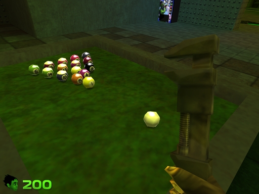
Indeed it's more of a juggling act - I tried to keep everything small but for this genre this seems to be impossible 🤔
alas the pool table is already in .. that was the very first thing I added 😔
Impressive stuff, particularly building out the engine yourself. What was the motivating factor behind doing the extra work versus using an "industry standard" engine?
Also, you've mentioned using "opengl" whenever people ask about the engine, however you haven't specified which specific libraries you're using, I'd be curious to know.
Looking forward to further releases!
well you see I started on the engine itself so long ago (try 15+ years) that back then the norm was everyone writing their own engine, there were countless websites but nowadays most of them (flipcode, devmaster etc.) have disappeared or changed
but frankly I also find it a lot easier - it's much more work but there is no risk of a big update breaking everything - I only have myself to blame when something breaks 😔
and I found that no matter what engine you use: you still end up writing your own mini engine inside it - at least I do - also for a big project every engine breaks 🤔
if you mean if I use a framework for OpenGL like sdl or glfw or something: nope it's raw OpenGL with the usual suspects: gl.h glext.h etc.
I had to wrote my own window handling to have proper fullscreen, mouselook and anti-aliasing (no framework I tried had it together for all of these)
but if you mean what other libs besides it:
OpenAL for playing sound
stb_vorbis for loading .ogg for music
dr_wav for loading wav files
stb_image for loading textures (.png mostly)
miniz.h for saving screenshots and loading compressed data (all the .dat files are just .zip s)
pugixml various map data and save files are in .xml
Definitely a solid nod to 90's computer scifi shooters
👍
hmm.. I really need add more clues about the generator 🤔
Hi I've made a video about the game and wanted to share some feedback about it, hopefuly it is useful to you ^^
-The gameplay mechanics are pretty interesting and well rounded overall, BUT I would suggest revising the slide mechanic since sometimes it seemed less accurate than I expected when trying to hit enemies with it.-The visuals are quite good and feel cohesive with the game and level design.
-I really liked the variety of enemies and I'll say that the "robot" ones are quite interesting ^^
In conclusion, the idea is great and I hope you keep working on it. Hopefully this is useful for the development :D, also if you could subscribe that would help me a lot :)
Regards
thank you! videos are invaluable help for fine tuning the gameplay 👍
You are welcome ^^
Hello, I enjoyed your demo quite a bit! I would suggest separating the bindings for "use" and "reload". Also I found a repeatable bug where the frames would drop for about 5-10 seconds after saving. I liked the weapon variety and the music/ambient sounds. Very cool game though!
glad you enjoyed it!
yup there are a lot of complaints about reload - will definitely be changed for the release 🤔
I think I found out what causes the save delay (turns out saving the little screenshot for the save menu takes more resources than I thought)
I've now played all of the ZORTCH demo, and I gotta say I do love it - but it's not without its flaws. Firstly, well the animations and sound effects need to be snappier for many things. You know Doom 2s Super Shotgun is like god slamming a car door? Yeah a lot of the things in Zortch are like the exact opposite of that. A lot of the weapon sounds are kinda wimpy, there's not enough of an exaggerated push back on the weapons when they fire animation wise, and the enemies weapon sounds are kinda quiet too. What gives? The other major gripe I have is the level design - it's not bad, by any means, but it needs more landmarks to help a player navigate the space. It all feels very similar, which is fine and I know is the norm for shooters of this ilk (think Unreal Gold, Quake 2, etc) but most importantly it's all FIXABLE. A few more very distinctive looking monitoring stations (bright monitors with some pipes coming out on top of a big computer box, something like that) and a blinking purple light in one corner of the map - got it, that'll make that area look more recognizably different, help players navigate. Those shotgun animations? Kill a few of the keyframes, make the animation punchier and for gods sakes, up the volume on those explosions and shotgun blasts! (Incidentally, there is one place you do this really well - and that's on the turrets and the sentry dogs. THAT is exactly what those weapons should sound like!). Currently this game's just a single strafe-jump in the wrong direction, but it would take so little work to polish it up and make it amazing. Lastly - your enemy designs are great. I'm not the biggest fan of the zombie robots - they're very grey, blend into the background too easily, probably need a few more blinking lights on them so we can tell them apart from the walls. But the absolute menagerie at the very end - that giant spawn thing on four legs?! The enemies with the firework guns? Yeah, there's something special here for sure. You just need to make like Spinal Tap and turn things up to 11, baby.
that's strange they are quite loud on my end .. it could be something do with OpenAL .. but if some of them sound ok then it might be just my sound choices 🤔
do you have a special sound setup? (like some surround thing like a special card or anything?)
I didn't have the same sound problems as this guy.
Дуже класно прям дуже.
Додайте мапу.
Та клавіши "швидке збереження" та "швидке завантаження"
I don't speak russian .. yet I understood some of the complaints 🤔
I think it's Ukrainian.
He said that he liked it very much and asked to add more maps and keys for quick saving and loading
thank you!
btw you can quicksave with F6 and quickload in F9 -- I'm surprised he didn't try(?) -- I guess I should add some sort of ingame help for these 🤔
I didn't use it as I almost didn't die even on the highest difficulty, but this truth may not be obvious to those who are not used to or don't know about these buttons. Yes, and I myself used F5 and F6 for this before, so I probably would not have guessed either.
Played it on hardest difficulty (don't know why, guess I wanted to flex my old-school fps muscles? he-he). LOVED IT! Did I see some inspirations from Half-Life and Duke 3D?
I kinda like how everything looks so rundown, and also that looking outside the windows you see a kind of metropolis, even though I was initially under the impression that the setting was a spaceship.
Suggestions?
- Why is Zortch green if she's a human? Or is that just the HUD? Will there be an intro-slideshow or something? I'm actually happy that you kept the backstory minimalistic, as way too many games nowadays cram exposition down players' throats, and it's annoying.
- Would also be nice to have some kind of manual, even as a .pdf file, or an in-game menu where we can read description on the enemies and weapons.
- While it's nice that the level looks rundown and lived-in, I'd suggest expanding the texture colour palette, because once the game gets released, people are gonna complain about samey grey-and-brown corridors.
- Also add total number of enemies vs number of enemies killed upon completing the level, or even a togglable in-game counter. You know, like in zDoom?
- While the demo level isn't too complicated to navigate in, depending on how you'll wanna go about the future levels, perhaps it would be wise to add a togglable mini-map or an automap?
Anyway, best of luck; looking forward to the game!
yup, Maxed diff is pretty much normal diff for experienced players 😉
- it goes from green to red based on how much hp you have left
- there will be one just very minimal (very few people open them - I need to explain ingame as much as possible)
- don't worry there are some coroful levels - it's only quite minimal on this first one (I should have included a second one in the test 🤔
- I don't keep track of it by intention: e.g. 100%-ing the game this way only means finding all secrets
- that would be nice, there are two reasons why there is not one: one is techincal: I'm simply not good enough yet to generate a reliable map based on the geometry
and the other is that getting lost is the whole point .. of course at first I thought the maps are too small and easy surely nobody will get lost.. but after seeing people play I'm not sure anymore 🤔
Hate to headbutt in, but here's somewhere that my comment about making distinctive areas would be useful. No need to make an automap - modern games don't have them, and yours doesn't need to either. Just make some areas feel more different than others. This doesn't need to be a total area overhaul, either - add some suspended animation tubes that give off blue light and a big sign over the top that says "CRYONICS SECTOR", another area just add some glowing yellow pipes, maybe dripping emissive liquid. Got a bunch of windows that look outdoors? Want to make that corridoor look different? Make a "huge" spaceship (a flattened sprite of a spaceship) fly past the windows emitting some light from its headbeams every few minutes, but only past THAT window/set of windows. There's ways to make this space easier to navigate without needing an automap, my man!
I sort of wanted the first level to be exploratory and people to get lost - to at least make the place feel bigger - but I guess it worked too well -- I already have some plans on how to simplify it based on the playthroughs I saw so far (and without removing areas) .. hopefully the beta test will shed light on problems on any later levels 🤔
Things I would like to see in the full game:
1) Whenever enemies attack you with a weapon, you can pick up that weapon from them.
2) Be able to heal by stepping on the remains of defeated enemies.
3) Maybe super powers as bullet-time, but it should be accompained by more enemies or more powerful.
thank you for your suggestions but unfortunately the game is kind of in the late stages to add them
1) it would be cool indeed - but it's a lot of extra work - and frankly I just simply didn't plan ahead enough to make it work
I tried to get around this to make your guns very similar (and often better e.g. the pistol is kind of same as the energy weapons the guards use but with the extra that is bounces off walls and homes on targets etc.)
2) I'm not exactly sure what you mean by this 😕
3) it would be cool to make a bullet-time game but once again I didn't plan ahead (it would be better to make a game centered around the concept from the ground up imho)
sorry it's just that I meant this to be a small game and it has already overgrown itself many times over - I pretty much have frozen the features and concentrating on finishing it asap
2) What I meant is that you can heal when you touch the pieces of dead enemies. But thanks you to answer!
You mean like, if Zortch eats defeated enemies' remains?
Yes.
gameplay wise it's a good idea.. but I would never hear the end of it 😔
well some enemies drop random items.. I should increase the chance they do 🤔
I loved your demo! It is simple but fun. A interesting thing is the differences between difficulties. First I played it in the easiest mode and then in the hardest mode, and they seem like two entirely different games. In hardest mode it's really challenging but fun, and it's very original that here the enemies only die if they are tear in pieces.
I'm glad you liked it, but it's just something many old FPS did (started with Nightmare difficulty in Doom - it was something they added later as a joke because there were complaints that Ultra Violence was too easy)
I didn't know that, thanks.
Do you have any more socials?
no, sorry
Really enjoyed the demo! The level was a little confusing to navigate, but I was able to figure it out within 20 minutes. Music and atmosphere was nice, the little bits of text had a nice bit of cute wit. Most notably however, I noticed enemies most often because I was taking damage, which leads me to think they should be making more noise so I can anticipate their presence. Reload and interact being the same key is a little odd -- In fact, having to reload at all is a little odd. Unless reloading weapons is going to come up in your gameplay loop, I might consider how important it is to you. If you do intend reloading to be a core element that forces you to switch weapons mid fight, perhaps reducing their capacity would help. Otherwise, toss the whole thing out and don't worry about reloading at all! It would be a shame to waste those animations, though.
hear hear .. they will be separated in the final version
at first there was no reload at all - but it felt weird for some of the weapons to not have one 🤔
(but I see where you are coming from - I tried to make the animations as fast as possible - it's more about adding flavour: they add a little immersion)
It plays like the amalgam of Quake 2, Unreal, Sin, and Blood2.
Your movement is a bit wobbly, therefore your aim is wobbly too I somehow like it.
Level design is great, lot of interconnected room, feels like a maze, excellent job here.
The secrets are quite easy to find, found all of them and I'm not particularly perceptive :-) They still feel good.
Atmosphere is nice. Music is a bit repetitive but the lighting and color palette helps the immersion a lot.
Enemies do not poes a huge threat though. That jump they do is a bit ridiculous, it is as if we were on the moon :-)
All in all you really captured that RAW retro feeling.
Basic keybindings work but making E both the use button and the reload button is a bit awkward.
Also, when your character is hit you he/she(?) sounds like a cat who got her tail stepped on :)
Keep up the good work!
thank you for your feedback!
I think it might be the camera roll that makes it feel wobbly .. but if you like it I guess I better not touch it 🤔
I just changed her pain sounds (there were many many complaints) so far they are only demonstrated in this video though:
(how do you feel about these?)
(but this is a question for everyone)
To be honest I thought I was playing a black dude, at least that was my first impression upon seeing the portrait. Based on the video I think you made some steps in the right direction. If you are hell-bent on having a heroine, then perhaps you should ask a friend (girl) and record some simple lines so there is no confusion.
(and no, I don't give a damn about liberalism, we in Central Europe think differently).
Keep up the good work, wish you great success in the future!
Peter from Hungary
that's alright I don't mind the confusion - as long as the sounds are not annoying 🤔
(me and my brother used to confuse redneck rampage to quake after all .. despite the title screen)
(a magyar verzióban Zortch le lesz cserelve Pákóra .. de psszt! 🤫
(áh tehát így állunk. Nagyon sok sikert kívánok!) Let me be the first one who buys this great game.
I had a really good time playing the demo! The level design gave a lot of freedom in exploring the world, there was enough ammos and resources scattered around to make the experience balanced, the secrets required a certain amount of attention but aren't as cheaply hidden as they can be in classic shooters, and the dark yet colorful graphics give a nice retro atmosphere - a sort of mix between Quake 2 and Doom 64. Enemies have some cool designs and the AI does a nice job keeping you on your toes, especially on the hardest difficulty. Finally, the weapons feel good and it's all so satisfying to blow monsters into gibs with the TNT or grenade launcher! My only slight bother was the heroine's sound effects: her grunts either sound too high pitched or too deep. I'm not fond of the head for the health icon either (it feels too much like a model out of Reboot), but that's a real minor detail.
An extremely good impression overall. I'll be following the game's progression. Good luck with the development! ;)
thank you for your feedback! I'm glad you enjoyed it!
(so many complaints about the pain sounds 🤔
sure - wait hold on - what sort of problem you experienced with the tnt?
it appears too dark? .. that could be a bug -- could you post a screenshot? (you can make one with F12 ingame)
Well played! 🎃 (doubly so)
I might have fixed this bug (or at least a very similar one) and it possibly won't be in the full version 😔
but I guess if there is a demand I can put it back in later 🤔
id say get rid of anything that casual players can come across. this is a quite difficult trick to execute and pretty much need to intentionally do it, that being said. i really enjoy playing :)
I really enjoy it so far. It's basically like an N64 title and I love it :D Also love how interactive the levels are. That's always fun to play around with things.
I feel like the FOV is a bot too narrow though. I would welcome the option to adjust it. That was my only problem. Other than that it's really great.
really liked to try this game but it does not run on my linux os with wine... to bad.
unfortunately linux support is low priority after the game is released I might start on it .. I wonder why it fails on wine though, I heard Melonman works smoothly on wine (and it uses the same engine) maybe it's a distro thing? 🤔
It shouldn't be too difficult to port your input and windowing code to use SDL2. It's just a platform translation wrapper, so you can keep the same codebase and you should be able to compile to Windows, Mac and Linux without really changing much in your build system.
indeed.. my real concern is with testing (and support) I'd like to figure out first what change caused wine to not run it anymore
I realised youre probably using DirectX instead of OpenGL so it might be a little more complicated 😅
it's OpenGL alright (I found it has the strange advantage to work under most windows versions unlike directx)
what's weird is I hear directx is easier to run with wine 🤔 (anyway I want to finish the game first and then start adding support for other OS)
what game engine do you used for this game ?
it's a custom made one (native C++, OpenGL, OpenAL etc.)
nice! I will need to remember to add a hint for the generator 🤔